March 5, 2026
9 min read
UI/UX
CSS
Design
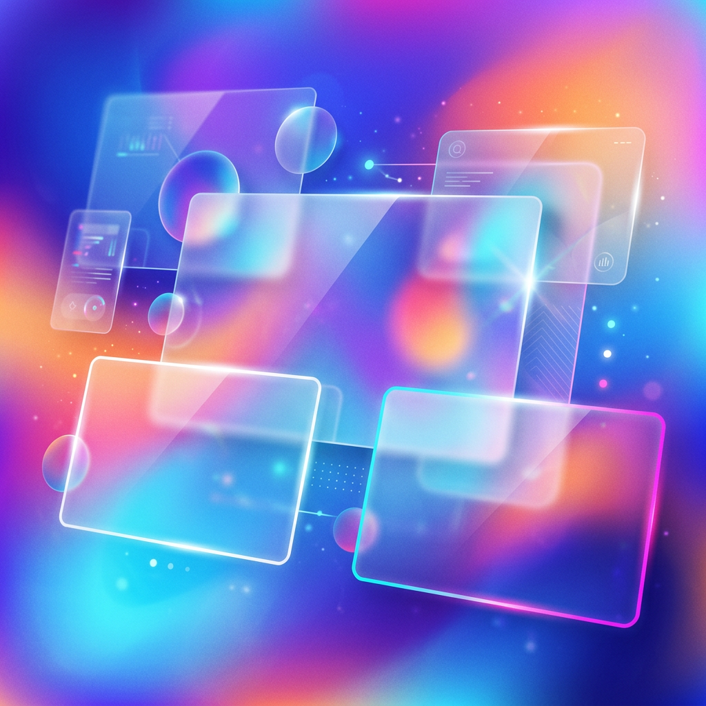
Mastering Glassmorphism: From Basics to Premium UI
Learn the secrets behind the frosted-glass look and how to implement high-performance glassmorphism in modern web apps.
The Rise of Glassmorphism
Glassmorphism is a design trend that has taken the digital world by storm. Characterized by transparency, multi-layered approach, and vivid colors, it creates a "frosted glass" effect that feels premium and modern.
Key Characteristics
- Transparency: Using background blur to create depth.
- Multi-layered approach: Elements floating in space.
- Vivid colors: To highlight the blurred transparency.
- Subtle borders: Light, thin borders to define the glass objects.
How to Implement in CSS
The core of glassmorphism is the backdrop-filter property.
.glass-card {
  background: rgba(255, 255, 255, 0.1);
  backdrop-filter: blur(10px);
  -webkit-backdrop-filter: blur(10px);
  border: 1px solid rgba(255, 255, 255, 0.2);
  border-radius: 16px;
}
This technique allows for a sophisticated look that maintains readability while showing off the underlying background elements.
Enjoyed this insight?
I write about cutting-edge tech, design systems, and the future of web development. Follow for more.